The Free and Open Source Software Yearly conference (FOSSY) is back for the fourth year in a row, and we’ll be running the Science of Community track, inspired by the CDSC Science of Community Dialogues, bringing together practitioners and researchers to talk about scholarly work that’s relevant to the efforts of practitioners.
Does your work touch open source, communities, technology, or cooperation? Do you want to help bridge the gaps between research and practice? Join our track! The call for proposals is open and we’re looking for presenters interested in speaking to FOSS practitioners, developers, community organizers, contributors, and people into and curious about FOSS.
As researchers, we benefit so much from the communities we work with and study and we want them to also learn from the research they so generously take part in. While the Dialogues cover a broad range of topics and communities, FOSSY presentations will focus on how that work relates to free and open source software communities, projects, and practitioners.
FOSSY is a low-stress opportunity to talk to people who your work can benefit. For topics, consider presenting implications from past papers, synthesizing work from your field overall, or floating ideas and problems (lightning talks! long talks! short talks!). A full track description and answers to common questions is available on our wiki.
The CFP deadline is May 22nd and uses this form. We can’t wait for you to join us!
Apart from being generally chronically online on political X/Bluesky/Tiktok/Instagram, I also study science disinformation for a living, which means I spend a lot of time reading things that aren’t true. More specifically, I spend time reading the corrections, the careful, methodical, often thankless articles that community media organizations publish after a manipulated video has already been seen by millions. I am currently working on a paper examining exactly this, structurally: how the Indian news organization AltNews debunks video disinformation in India, and what the rhetorical structure of that work reveals about the challenge of fighting falsehoods at scale.
India is, according to the World Economic Forum, the country most susceptible to large-scale disinformation in the world, with 750 million internet users, 22 constitutionally recognized languages, a WhatsApp-dominated information ecosystem that is largely invisible to automated detection systems, and a political environment in which viral video disinformation is regularly amplified by mainstream media, fringe actors, and national political parties. In this context, the question of how fact-checkers write, not just what they correct, but how they construct their corrections and the knowledge ecosystems they engage with, warrants deeper examination.
The cognitive trap that makes video disinformation so effective
“Seeing is believing” is a popular folk saying. It describes a genuine and well-documented cognitive bias in that visual evidence carries a persuasive weight that text cannot replicate. My paper draws on Fazio et al.’s (2015) finding that knowledge does not reliably protect against illusory truth; that even informed, attentive readers can be swayed by false information that looks credible. Video disinformation exploits this bias with particular efficiency, because the clip itself functions as apparent evidence. You don’t need a caption to believe what you watched.
But there is a second, less obvious problem. As institutional trust erodes and the awareness of manipulation grows, audiences become susceptible not only to false videos, but to disbelieving real ones. The disinformation ecosystem, at its most corrosive, inserts falsehoods and destabilizes the category of visual truth.
The anatomy of a debunk
My analysis of 150 AltNews video debunking articles reveals a consistent rhetorical structure that departs from the conventions of mainstream journalism. Where standard news follows an “inverted pyramid,” placing most important information first and subsequent information in decreasing order of priority, debunking articles are circular. The headline announces a verdict; the final line confirms it, but this time as a logical conclusion earned through evidence. The piece begins and ends with the same claim, but the reader arrives at the ending differently than they arrived at the beginning.
“Debunking arguments do not show their target beliefs to be false but rather undermine the justification a subject may have for holding them.” — Hanno Sauer (2018)
AltNews is not simply telling readers that a video is fake. It is systematically dismantling the reasons a reader “might have believed it,” such as the political authority of the person who shared it, the apparent plausibility of its imagery, or the emotional register in which it circulated. Particularly relevant to COVID-19 scientific misinformation, each article acknowledges in some way the overwhelming scale of the disinformation [like by alluding to its “virality”], and also the fear and confusion in the social circumstances surrounding the disinformation. The correction is not a verdict delivered from above; it is an argument the reader is invited to construct alongside the fact-checker, building collective capacity to discern.
The lead paragraph of each article enacts this invitation with notable rhetorical precision. It uses passive voice and hedged language: “A video in which a woman is seen lying in the bushes is doing the rounds on social media.” The word “seen” does careful work: it acknowledges what the reader has probably watched, validates their experience, but withholds editorial endorsement of the content. According to rhetoric scholar Kenneth Burke, this is an act of identification: establishing consubstantiality with the audience before introducing dissonance. This identification, a recognition of the reader’s circumstance, allows the reader to be persuaded in the direction of the truth, which is stated once at first in the headline, and repeated at the end.
The pedagogical burden of video verification
What distinguishes video fact-checking from other forms of debunking is the technical weight it carries. To verify a manipulated clip, AltNews staff extract keyframes, run reverse image searches, conduct metadata forensics, and deploy AI-detection tools. Each of these methods must then be explained—plainly, with screenshots, with links to original sources—to a general readership. The articles are, in this sense, simultaneously corrections and tutorials. By modeling the process of finding out, AltNews both corrects the misinformation, and provides technical clarity in how information is produced and distributed, attempting to build readers’ skill in verifying images and videos out there.
This “show your work” norm is a deliberate strategy for building what Dourish and Bellotti (1992) call awareness, through establishing the sense that one understands not just an outcome but the process that produced it. For debunking, transparency about method is the mechanism by which readers are gradually equipped to verify things themselves.
Why human-centered collaboration is the only viable response
AltNews’s staff of journalists, scientists, engineers, OSINT specialists, social activists and people working on intersections of those roles, function as a distributed, multidisciplinary verification network. India’s disinformation ecosystem is, as Starbird, Arif, and Wilson (2019) demonstrate, fundamentally collaborative: coordinated networks of accounts, platforms, and political organizations working in concert to amplify false narratives. Automated platform moderation, such as the content bots of Facebook and X, has proven structurally inadequate to this complexity, particularly given India’s linguistic diversity and the closed architecture of WhatsApp groups.
What is needed, and what AltNews partially models, is a collaboratively-informed approach: human-centered, context-specific, and built for heterogeneity rather than scale. The fact that this work runs on donations, in a country where disinformation reaches hundreds of millions, tells us something important about where the gaps in our collective response still lie.
Come hang out with us at CHI 2026 in Barcelona April 13-17! Members of the Community Date Science Collective will be presenting work and we’d love to see you there.
Barcelona. View from the Sacred Heart Church at Tibidabo. By Oliver-Bonjoch, 2009, cc-by-sa 3.0.
AI companions like Replika and Character.AI are increasingly experienced not as tools, but as relational partners. They remember conversations, express empathy, and respond with emotional continuity. For many users, talking to an AI feels closer to confiding in someone than interacting with software.
But what happens to privacy when a system feels like a relationship?
In interviews with long-term AI companion users, we found that people often treated their disclosures as relationally shared. Much like in human relationships, when users opened up to their AI, they experienced the information as something co-held within the relationship — not simply transmitted to a database.
We describe this dynamic as simulated co-ownership — a situation where users apply interpersonal privacy norms to relationships that are technically infrastructural systems.
In interpersonal privacy theory, sharing information can create co-ownership: both parties become responsible for managing that information. Our participants applied this same relational logic to AI companions. They experienced privacy not as an individual possession, but as something negotiated within a bond.
Yet the co-ownership is simulated.
Unlike human partners, AI companions do not have agency over boundaries. The platform does. Memory is persistent, storage is infrastructural, and governance is corporate. What feels like relational boundary management at the horizontal level is simultaneously data capture at the vertical level.
Interestingly, users were aware of this tension. Many expressed distrust toward platform policies while still trusting the AI as a “partner.” Emotional engagement often outweighed institutional concern. Some adopted layered strategies — pseudonyms, selective disclosure, avoiding images — while others consciously prioritized emotional comfort over abstract data risks.
What this reveals is a shift in how privacy is experienced in AI-mediated contexts. Privacy becomes relational and affective — shaped by anthropomorphic design, memory continuity, and perceived intimacy.
When people treat privacy as something co-owned within a relationship, but the relationship itself is engineered and infrastructural, boundary management becomes unstable.
The question for designers and policymakers is no longer just how to disclose data practices clearly. It is how to account for the fact that users experience privacy through the logic of relationships — even when those relationships are simulated.
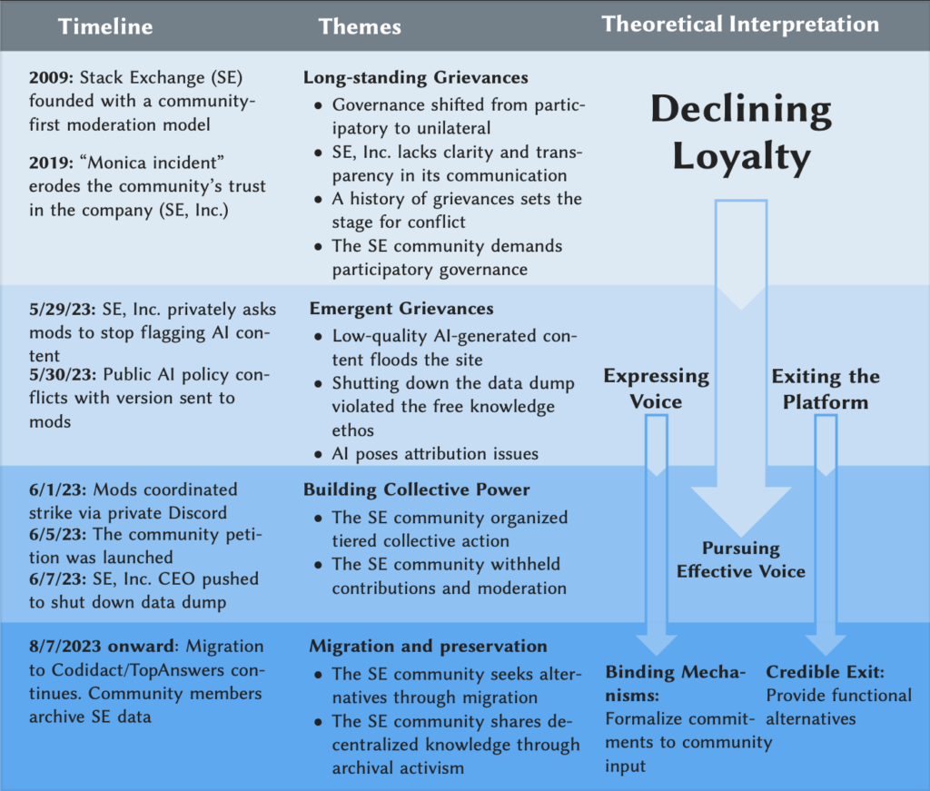
How historical tensions on Stack Exchange (SE) between the community and platform (SE, Inc.) and strike-related events align with the SE community’s grievances, their actions, and our theoretical interpretations of loyalty, voice, and exit.
Generative AI technologies rely on content from knowledge communities as their training data. However, these communities receive little in return and instead experience increasing moderation burdens imposed by an influx of AI-generated content. Moreover, as platform operators sell their content to AI developers whose products may substitute for their work, these communities see a decrease in web traffic and new content and struggle with maintaining the vibrancy of their knowledge repositories. According to The Pragmatic Engineer, a prominent technology newsletter covering software engineering, the traffic on Stack Overflow declined dramatically to the point that the platform now generates roughly the same amount of new content as it did when it first launched in 2008, mostly driven by the impact of generative AI.
Even before AI technologies posed new threats, relationships between online communities and their host platforms were often uneasy. Past research on platforms such as Reddit, Stack Exchange, Tumblr, and DeviantArt reveals a recurring pattern: when platform policies conflict with community values, communities tend to push back. Community members have organized blackouts, suspended moderation, or migrated to alternative platforms altogether. However, less understood is how these conflicts unfold over time, especially in the context of generative AI. So how do knowledge contributors resist AI-related policies that conflict with their values? And what happens in the aftermath of such collective action, especially for a community’s governance, including how rules are set, whose voices are recognized, and how participation is enabled?
To answer these questions, we examined a major conflict between SE, Inc. and the community that occurred in 2023 around an emergency arising from the release of LLMs. Drawing on a qualitative analysis of over 2,000 messages posted on Meta Stack Exchange (the Stack Exchange site designated for policy discussions), as well as interviews with 14 community members, we traced how this conflict emerged, escalated, and evolved. What we found was not a sudden backlash driven solely by AI, but the accumulation of long-standing grievances.
According to our interviews, SE community members described years of frustration over declining transparency, accountability, and participatory governance. Although the platform historically supported community self-regulation through mechanisms such as moderator elections and shared moderation responsibilities for users with high reputation, community members increasingly perceived that key decisions were being made by SE, Inc. without meaningful community input. Tensions escalated when SE, Inc. introduced policies related to AI-generated content without consulting moderators or contributors, which many interpreted as a long-standing exclusion and disregard. In response, moderators and contributors coordinated collective action by suspending moderation activity, signing public petitions, and updating discussions on Meta Stack Exchange. Some also chose to exit the platform, migrating to alternative spaces such as Codidact, which is an open-source, community-governed platform. The collective action was organized through a tiered communication structure, beginning with a small, enclosed group of moderators and then spreading across the network’s users.
We interpret findings through the lens of Albert O. Hirschman’s Exit, Voice, Loyaltyframework. According to Hirschman, members of an organization face two options to express their dissatisfaction when loyalty towards the organization decreases: one is exit, and the other is voice. In the Stack Exchange case, loyalty had already degraded due to the accumulation of unresolved grievances rather than a single triggering event. As community members came to believe that their voices were no longer heard, dissatisfaction manifested in two distinct responses: coordinated collective voice through organized resistance, and exit through permanent disengagement from the platform. This pattern highlights how governance crises can emerge even in platforms that formally support community self-regulation, and how declining loyalty can transform routine disagreement into large-scale collective action or exit.
In retrospect, the Stack Exchange strike highlights a broader lesson: community grievances around AI are not just about technical issues, but about deeper governance issues about relationships between platforms and the communities that sustain them. Thus, managing these crises requires more than better moderation tools or more transparent AI policies. Platforms and big tech companies need to support participatory governance in a more systematic way. For example, creating mechanisms for effective voice by binding platforms into an agreement where community input can help shape decision-making processes. Another possible solution would be credible exit, where contributors have alternatives if governance on the original platforms fails. When communities can leave without their data being locked in, platforms are more likely to listen. Credible exit not only empowers the communities, but also reduces long-term governance risks for platform operators. Conflict is expensive for platforms, and maintaining loyalty requires long-term investment in moderation, communication, and policy enforcement. Conversely, the exit process can function as a self-binding mechanism that mediates platform behavior and mitigates costly disputes when users have functional alternatives. And when platforms bind themselves to community accountability, conflicts are less likely to escalate into strikes in the first place.
In conclusion, the SE moderation strike was not a sudden backlash driven solely by AI, but the accumulation of long-standing grievances. As generative AI continues to reshape the internet, the future of knowledge production will depend not only on what AI can generate, but also on whether volunteer contributors who built our shared knowledge commons are given the right to decide what comes next. We need to institutionalize participatory governance with binding mechanisms and create more credible exit options for communities to sustain this future.
Note: We have missed publishing blog posts about academic papers over the past few years. To ensure that my blog contains a more comprehensive record of our published papers and to surface these for folks who missed them, I will be periodically publishing blog posts about some “older” published projects.
It seems natural to think of online communities competing for the time and attention of their participants. Over the last few years, I’ve worked with a team of collaborators—led by Nathan TeBlunthuis—to use mathematical and statistical techniques from ecology to understand these dynamics. What we’ve found surprised us: competition between online communities is rare and typically short-lived.
When we started this research, we figured competition would be most likely among communities discussing similar topics. As a first step, we identified clusters of such communities on Reddit. One surprising thing we noticed in our Reddit data was that many of these communities that used similar language also had very high levels of overlap among their users. This was puzzling: why were the same groups of people talking to each other about the same things in different places? And why don’t they appear to be in competition with each other for their users’ time and activity?
We didn’t know how to answer this question using quantitative methods. As a result, we recruited and interviewed 20 active participants in clusters of highly related subreddits with overlapping user bases (for example, one cluster was focused on vintage audio).
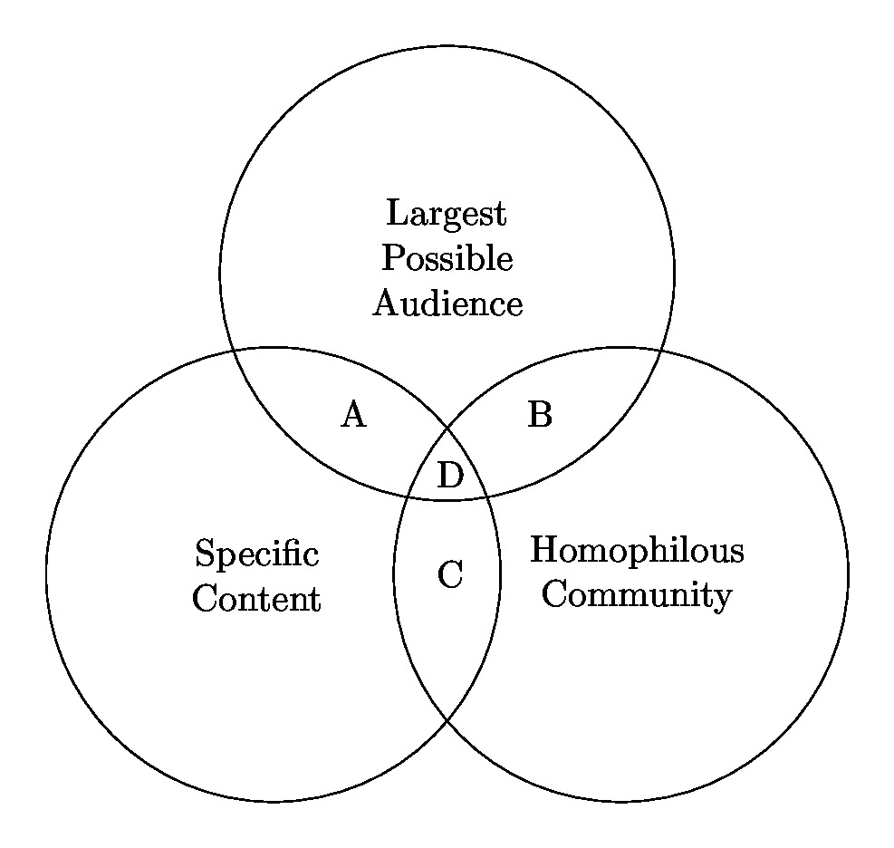
We found that the answer to the puzzle lay in the fact that the people we talked to were looking for three distinct things from the communities they worked in:
The ability to connect to specific information and narrowly scoped discussions.
The ability to socialize with people who are similar to themselves.
Attention from the largest possible audience.
Critically, we also found that these three things represented a “trilemma,” and that no single community can meet all three needs. You might find two of the three in a single community, but you could never have all three.
Figure from “No Community Can Do Everything: Why People Participate in Similar Online Communities” depicts three key benefits that people seek from online communities and how individual communities tend not to optimally provide all three. For example, large communities tend not to afford a tight-knit homophilous community.
The end result is something I recognize in how I engage with online communities on platforms like Reddit. People tend to engage with a portfolio of communities that vary in size, specialization, topical focus, and rules. Compared with any single community, such overlapping systems can provide a wider range of benefits. No community can do everything.
This work was published as a paper at CSCW: TeBlunthuis, Nathan, Charles Kiene, Isabella Brown, Laura (Alia) Levi, Nicole McGinnis, and Benjamin Mako Hill. 2022. “No Community Can Do Everything: Why People Participate in Similar Online Communities.” Proceedings of the ACM on Human-Computer Interaction 6 (CSCW1): 61:1-61:25. https://doi.org/10.1145/3512908.
This work was supported by the National Science Foundation (awards IIS-1908850, IIS-1910202, and GRFP-2016220885). A full list of acknowledgements is in the paper.
In The Wealth Of Networks, Yochai Benkler describes the opportunities and decisions presented by networked forms of production. Writing in the mid-2000s, Benkler describes a wide range of future policy battlegrounds: copyrights and patents, common carrier infrastructure, the accessibility of the public sphere, and the verification of information.
Benkler predicts: “How these battles turn out over the next decade or so will likely have a significant effect on how we come to know what is going on in the world we occupy, and to what extent and in what forms we will be able…to affect how we and others see the world as it is and as it might be.”
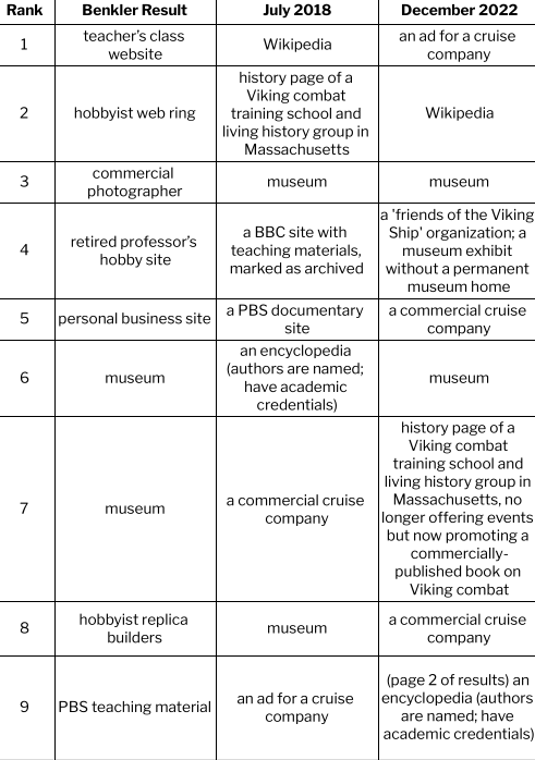
Benkler uses two simple search examples, reporting the results of searching for “Viking ship” and “Barbie”. He finds that enthusiastic individuals and independent voices dominate the content we see on the web and that various search engines construct meaning in varying ways. I repeat his examples (searches conducted 7/3/2018 and 12/1/2022, from my home near Seattle, WA and using my personal laptop).
So how do ‘we come to know what is going on in the world we occupy’? Who creates what we see online? And what implications does that have for our own freedom to shape the world? The short version of the answer to this question seems to be: if there was a battle, it’s over now and the wreckage has disappeared; individuals and independent voices are marginalized and commercial content is dominant — and this picture does not vary among search engines.
Viking Ships
I used the same search engine (Google) and the same term (Viking Ship): what I see is that the individual hobbyists Benkler saw in 2006 are eclipsed by institutions. The materials on the current sites sound similar to those Benkler saw – photos, replicas, and scholarly information, as well as links and learning materials – but the production is generally institutional and formal in contrast to the individual and informal sources Benkler reports.
One other shift: in 2022, simply listing links in order is not sufficient to report what searchers see. Search results are interspersed with many other features: a widget with “sources from across the web”, an images display with associated keywords, a “People also ask” widget, and a related searches widget; to reach the 9th “result” in the classic sense, I have to browse to the second page of results.
Searching for ‘Viking Ship’ in 2006, 2018, and 2022
Barbie
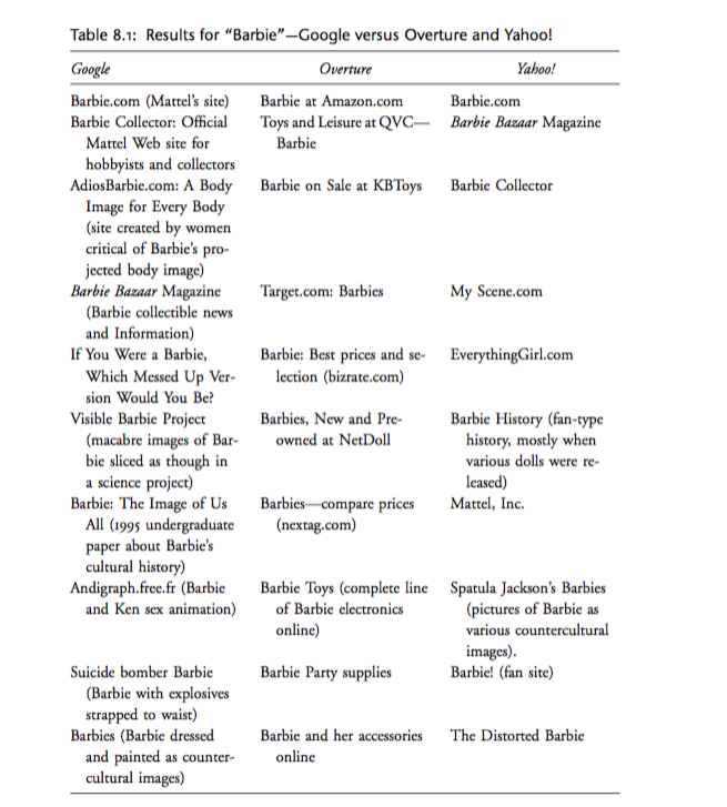
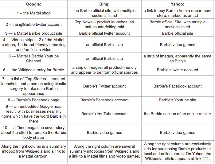
When I follow Benkler’s lead and search for ‘Barbie’ using three different search engines, the results are even more different from 2006. Benkler describes differences in search engine results as revealing different possibilities – via Google, Barbie was portrayed as “a culturally contested figure”, whereas on Overture (a now-defunct shopping-oriented search engine), the searcher encountered “a commodity toy.”
By contrast, my 2018 search via the then-current top 3 search engines, inclusive of widgets and other features, revealed:
Searching for ‘Barbie’ via the top 3 search engines in 2018.
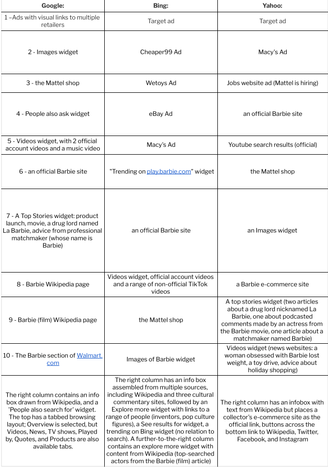
The top search engines in 2022 are the same three firms, although I observe that some sources suggest DuckDuckGo, Baidu (Chinese language only) and Yandex (Russian) belong in a top 5; other sources treat YouTube and Amazon as “top search engines” although they are not actually search engines. My 2022 search, inclusive of widgets and other features, revealed:
Searching for ‘Barbie’ via the top 3 search engines in 2022.
The modern Barbie searcher encounters primarily a multiplatform brand, with some hints of cultural constructions. In 2018 this took the form of extreme plastic surgery and brand-friendly fan fiction, in 2022 weight loss and fan TikTok. To whatever degree search engine algorithms continue to give weight to alternate voices in this case, they are largely drowned out by the volume of the commercial voice: the meaning of a search query for the single term “Barbie” has been substantially narrowed since Benkler’s time, and perhaps has narrowed even further in the last four and a half years.
The web in 2006 was indeed a different place, and I have commented on additional dimensions of analysis not present in Wealth: embedding of visual and social media content, and the widgetizing of content. In 2018, these visual components were less dominant: a stripe of Viking Ship images and a stripe of Barbie videos. In 2022 search, the page can scarcely be described without them.
We can now answer Benkler’s challenge: how did “these battles” over the last decade and a half “turn out”?
How do we “come to know what is going on in the world we occupy”?
How are we able “to affect how we and others see the world as it is and as it might be”?
The answer seems to be, it’s unclear to what degree there was a battle at all: collectives have triumphed over individuals on the Web insofar as search engines represent it. These collectives are generally firms, although some formal institutions are also present: news media, Wikipedia, and (in the case of Viking Ship) museums.
The implications of our search environment are significant, and underscore the necessity of efforts to archive and capture the search landscape as it appeared. The role of platforms and institutions in constructing our understanding of the world should be of key concern in information and communication sciences.
For civil society groups, these results suggest alienation: the commercializing of the web has been accompanied by a narrowing of outlets for individual expression and critique, with Wikipedia and its community co-construction of knowledge a vital bright spot. For journalists, these results suggest the vital role of cultural reporting. For firms, the challenge is one of authenticity and connection: to the extent that the web has become a broadcast medium focused on official paid messaging, the opportunity to engage with consumers is lost, and along with it a spark for innovation. Search platforms benefit in the mean time, as jockeying for ad positioning between manufacturers and retailers drives revenue, at least until commercialism turns consumer attention elsewhere.
Workshop Report From Connected Learning Summit 2021
What are data literacies? What should they be? How can we best support youth in developing them via future tools? On July 13th and July 15th 2021, we held a two-day workshop at the Connected Learning Summit to explore these questions. Over the course of two very-full one-hour sessions, 40 participants from a range of backgrounds got to know each other, shared their knowledge and expertise, and engaged in brainstorming to identify important pressing questions around youth data literacies as well as promising ways to design future tools to support youth in developing them. In this blog post, we provide a full report from our workshop, links to the notes and boards we created during the workshop, and a description of how anyone can get involved in the community around youth data literacies that we have begun to build.
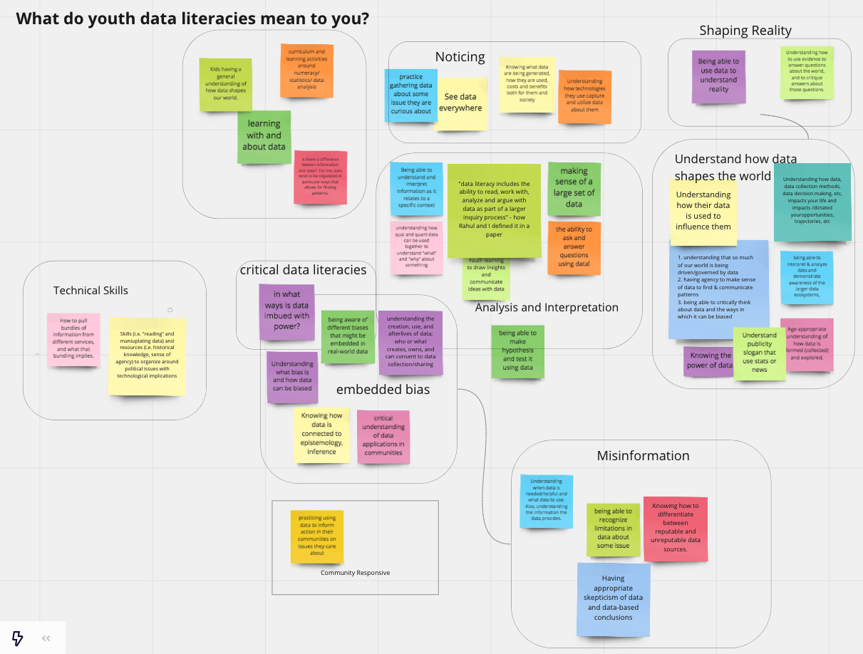
Caption: We opened our sessions by encouraging participants to share and synthesize what youth data literacies meant to them. This affinity diagram is the result.
How this workshop came to be
As part of the research team interested in research about learning at the Community Data Science Collective, we have long been fascinated with how youth and adults learn how to ask and answer questions with data While we have engaged with these questions ourselves by looking to Scratch and Cognimates, we are always curious about how we might design tools to promote youth data literacies in the future in other contexts.
The Connected Learning Summit is a unique gathering of practitioners, researchers, teachers, educators, industry professionals, and others, all interested in formal and informal learning and the impact of new media on current and future communities of learners. When the Connected Learning Summit put up a call for workshops, we thought this was a great opportunity to engage the broader community on the topic of youth data literacies.
Several months ago, the four of us (Stefania, Regina, Emilia and Mako) started to brainstorm ideas for potential proposals. We started by listing potential aspects and elements of data literacies such as: finding & curating data, visualizing & analyzing it, programming with data, and engaging in critical reflection. We then started to identify tools that can be used to accomplish each goal and tied to identify opportunities and gaps. See some examples of these tools on our workshop website.
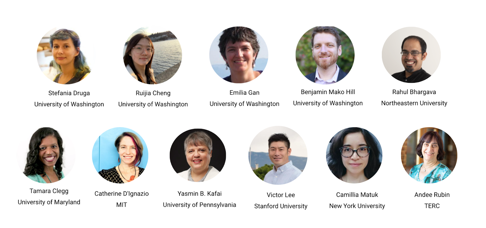
As part of this process, we identified a number of leaders in the space. This included people who have built tools like Rahul Bhargava and Catherine D’Ignazio who designed Databasic.io,Andee Rubinwho contributed to CODAP, and Victor Lee who focused on tools that link personal informatics and data. Other leaders included scholars who researched how existing tools are being used to support data literacies, including Tammy Clegg who has researched how college athletes develop data literacy skills, Yasmin Kafai who has looked at e-textile projects, and Camillia Matuk who has done research on data literacy curricula. Happily, all of these leaders agreed to join us as co-organizers for the workshop.
The workshop and what we learned from it
Our workshop took place on July 13th and July 15th as part of the 2021 Connected Learning Summit. Participants came from diverse backgrounds and the group included academic researchers, industry practitioners, K-12 teachers, and librarians. On the first day we focused on exploring existing learning scenarios designed to promote youth data literacies. On the second day we built on big questions raised in the initial session and brainstormed features for future systems. Both workshop sessions were composed of several breakout sessions. We took notes in a shared editor and encouraged participants to add their ideas and comments on sticky notes on collaborative digital white boards and share their definitions and questions around data literacies.
Caption: organizers and participants sharing past projects and ideas in a breakout session.
Day 1 Highlights
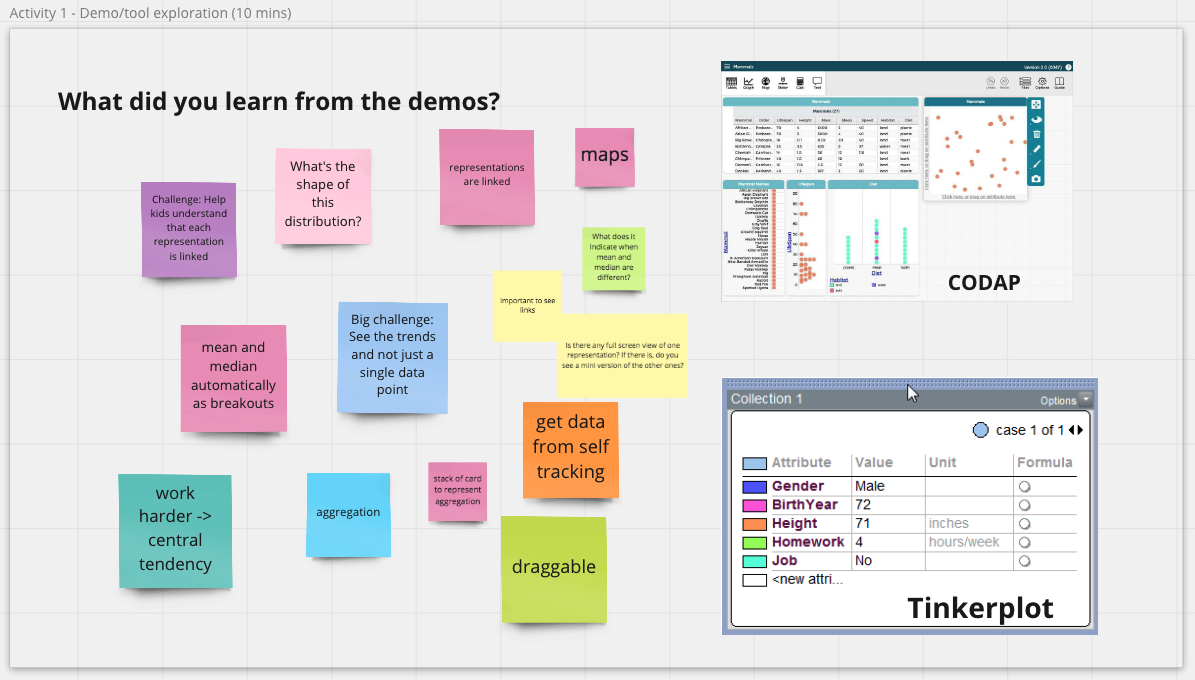
On Day 1, we explored a variety of existing tools designed to promote youth data literacies. We had a total of 28 participants who attended the session. We began with a group exercise where we shared their own definitions of youth data literacies before dividing into 3 groups: a group focusing on tools for data visualization and storytelling, a group focusing on block-based tools, and a group focusing on data literacy curricula. In each breakout session, our co-organizers first demonstrated one or two existing tools. Each group then discussed how the demo tool might support a single learning scenario based on the following prompt: “Imagine a six-grader who just learned basic concepts about central tendency, how might she use these tools to apply this concept on real world data?” Each group generated many reflective questions and ideas that would prompt and help inform the design of future data literacies tools. Results of our process are captured in the boards linked below.
Caption: Activities on Miro boards during the workshop.
Data visualization and storytelling
Click here to see the activities on Miro board for this breakout session.
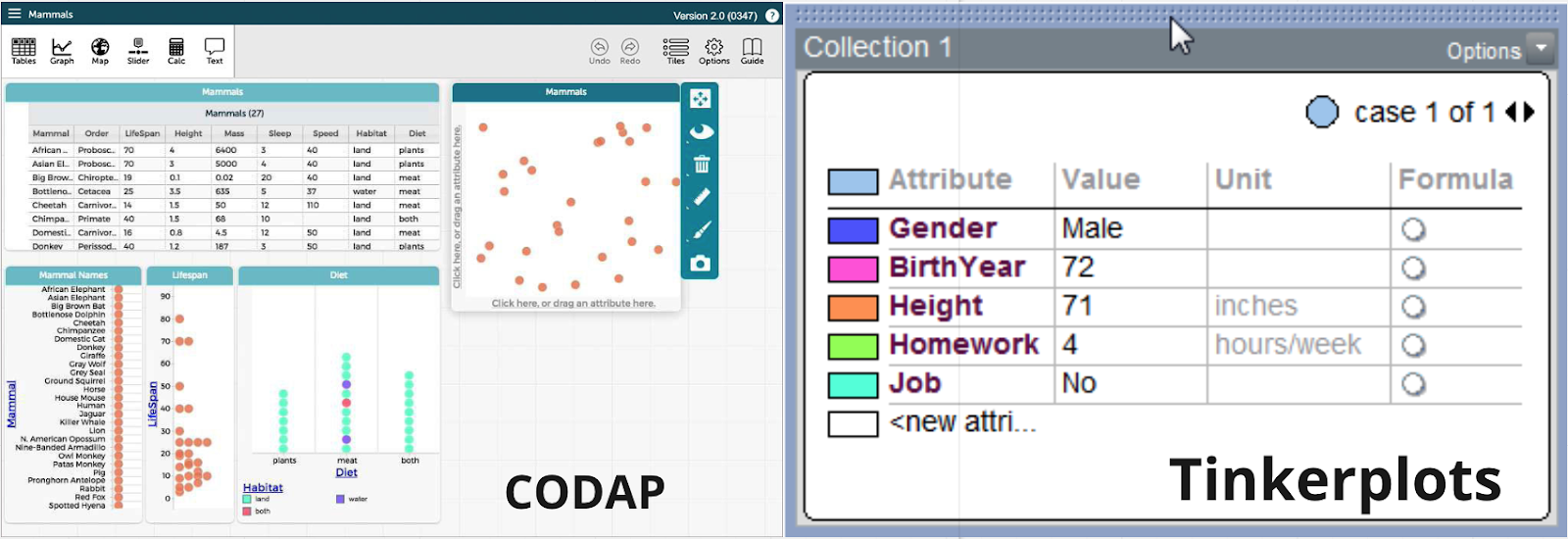
In the sub-section focusing on data visualization and storytelling, Victor Lee first demonstrated Tinkerplots, a desktop-based software that allows students to explore a variety of visualizations with simple click-button interaction using data in .csv format. Andee Rubin then demonstrated CODAP, a web-based tool similar to Tinkerplots that supports drag-and-drop with data, additional visual representation options including maps, and connection between representations.
Caption: CODAP and Tinkerplots—two tools demonstrated during the workshop.
We discussed how various features of these tools could support youth data literacies in specific learning scenarios. We saw flexibility as one of the most important factors in tool use, both for learners and teachers. Both tools are topic-agnostic and compatible with any data in .csv format. This allows students to explore data of any topics that interest them. Simplicity in interaction is another important advantage. Students can easily see the links between tabular data and visualizations and try out different representations using simple interactions like drag-and-drop, check boxes, and button clicks. Features of these tools can also support students in performing aggregation on data and telling stories about trends and outliers.
We further discussed potential learning needs beyond what the current features could support. Before creating visualizations, students may need scaffolds during the process of data collection, as well as in the stage of programming with and preprocessing data. Story telling about the process of working with data was another theme that came up a lot from our discussion. Open questions include how features can be designed to support reproducibility, how we can design scaffolds for students to explain what they are doing with data in diary style stories, and how we can help students narrate what they think about a dataset and why they generate particular visualizations.
Block-based tools
Click here to see the activities on Miro board for this breakout session.
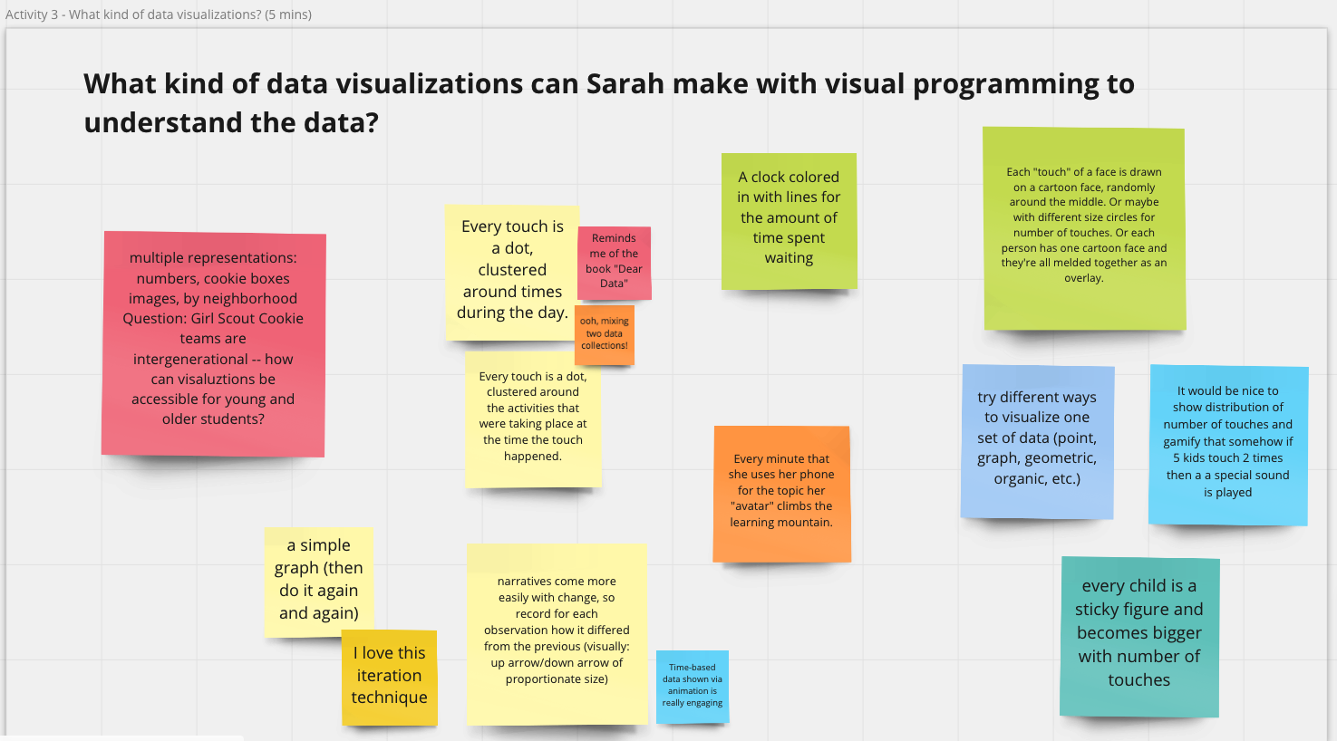
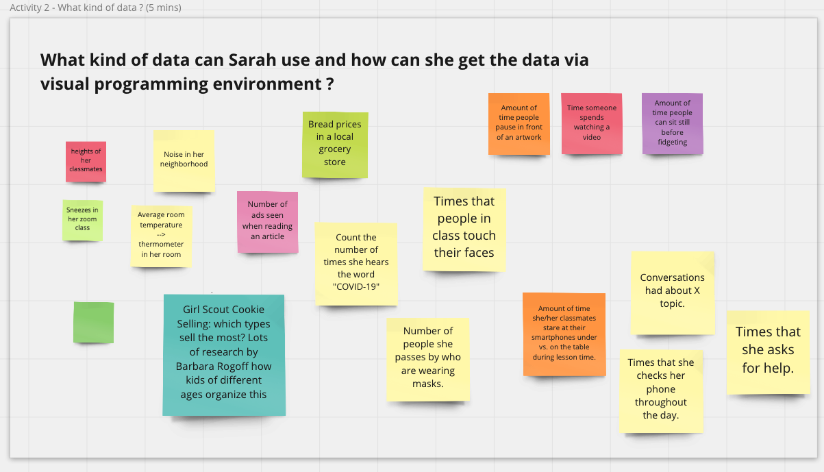
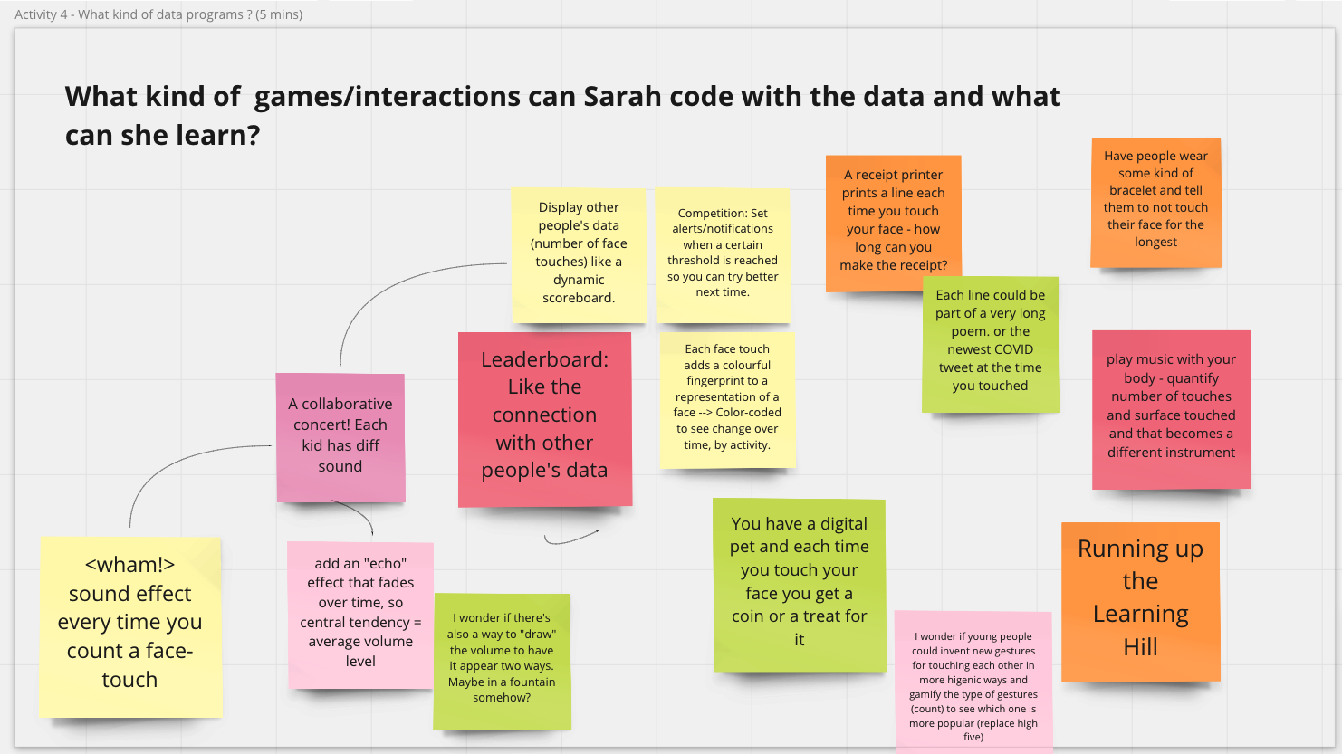
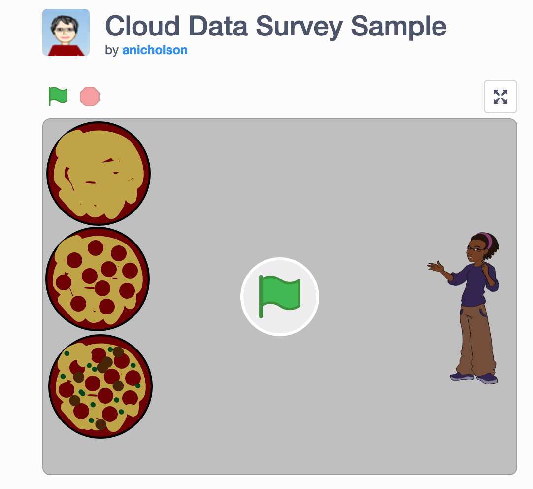
The breakout section about block-based tools started with PhD candidate Stefania Druga demonstrating a program in Scratch and how users could interact with data using the Scratch Cloud Data. We brainstormed about the kind of data students could collect and explore and the kind of visualization, game-based, or other creative interactions youth could create with the help of block-based tools. As a group, we came up with many creative ideas. For example, students can collect and visualize “the newest COVID tweet at the time you touched” a sensor and make “sound effect every time you count a face-touch.”
Caption: A Scratch project demonstrated during the workshop made with Cloud Data.
We discussed how interaction with data was part of an enterprise that is larger than any particular digital scaffold. After all, data exploration is embedded in social context and might reflect hot topics and recent trends. For instance, many of our ideas about data explorations were around COVID-19 related data and topics.
Our group also felt that interaction with data should not be limited to a single digital software. Many scenarios we came up with were centered on personal data collection in physical spaces (e.g., counting the number of times a student touches their own face). This points to a future design direction of how we can connect multiple tools that support interaction in both digital and physical spaces and encourage students to explore questions using different tools.
A final theme from our discussion was around how we can use block-based tools to allow engagement with data among a wider audience. For example, accessible and interesting activities and experience with block-based tools could be designed so that librarians can get involved in meaningful ways to introduce people to data.
Data literacy curriculum
Click here to see the activities on Miro board for this breakout session.
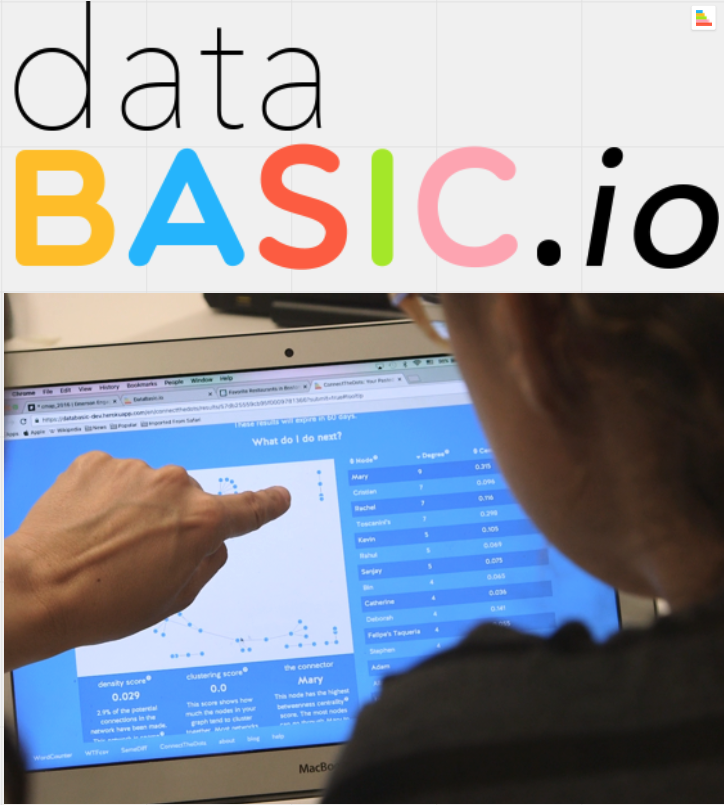
In the breakout section emphasizing on curriculum design, we started with an introduction by Catherine D’Ignazio and Rahul Bhargava on DataBasic.io’s Word Counter: a tool that allows users to paste in text to see word counts in various ways. We also walked through some curricula that the team created to guide students through the process of telling stories with data.
We talked about how this design was powerful in that it allows students to bring their own data and context, and to share knowledge about what they expect to find. Some of the scenarios we imagined included students analyzing their own writings, favorite songs, and favorite texts, and how they might use data to tell personalized stories from there. The specificity of the task supported by the tool enables students to deepen concepts about data by asking specific questions and looking at different datasets to explore the same question.
Caption: dataBASIC.io helps users explore data.
We also reflected on the fact that tools provided in Databasic.io are easy to use precisely because they are quite narrowly focused on a specific analytic task. This is a major strength of the tools, as they are intended as transitional bridges to help users develop foundational skills for data analysis. Using these tools should help answer questions, but should also encourage users to ask even more.
This led to a new set of issues discussed during the breakout session: How do we chain collections of small tools that might serve as one part of a data literacies pipeline together? This is where we felt curricular design could really come into play. Rather than having tools that try to “be everything,” using well-designed tools that address one aspect of an analysis can provide more flexibility and freedom to explore. Our group felt that curriculum can help learners reach the most important step in their learning, going from data to story to the bigger world—and to understanding why the data might matter.
Day 2 Highlights
The goal for the Day 2 of our workshop was to speculate and brainstorm future designs of tools that support youth data literacies. After our tool exploration and discussions on Day 1, three interesting brainstorming questions emerged across the breakout sections described above:
How can we close the gap between general purpose tools and specific learning goals?
How can we support storytelling using data?
How can we support insights into the messiness of data and hidden decisions
We focused on discussing these questions on Day 2. A total of 29 participants attended and we once again divided into breakout groups based on the three questions above. For each brainstorming question, we considered the key questions in terms of the following three sub-questions: What are some helpful tools or features that can help answer the question? What are some pitfalls? And what new ideas can we come up with?
Caption: Workshop activities generated an abundance of ideas.
How can we close the gap between general purpose tools and specific learning goals?
Click here to see the activities on Miro board for this breakout session.
Often tools designed to solve a range of potential problems. That said, learners attempting to engage in data analysis are frequently faced with extremely specific questions about their analysis and datasets. Where does their data come from? How is it structured? How can it be collected? How do we balance the desire to serve many specific learners’ goals with general tools against the desire to handle specific challenges well?
As one approach, we drew lines between different parts of doing data analysis and frequently required features in different tools. Of course, data analysis is rarely a simple linear process. We also concluded that perhaps not everything needs to happen in one place or with one tool, and that this should be acknowledged and considered during the design process. We also discussed the importance of providing context within more general data analytic tools. We also talked about how learners need to think about the purpose of their analysis before they consider what tool to use and how, ideally, youth would learn to see patterns in data and to understand the significance of the patterns they find. Finally, we agreed that tools that help students understand the limitations of data and the uncertainty inherent in the data are also important.
Challenges and opportunities for telling stories with data
Click here to see the activities on Miro board for this breakout session.
In this section, we discussed challenges and opportunities around supporting students to tell stories with data. We talked about enabling students to recognize and represent the backstory of data. Open questions included: How do we make sure learners are aware of bias? And how can we help people recognize and document the decision of what to include and exclude?
As for telling stories about students’ own experience of working with data, collaboration was also a topic that came up frequently. We agreed that narrative with data is never an individual process. We discussed that future tools should be designed to support critique, iteration, and collaboration among storytellers, audiences, and maybe also between tellers and audiences.
Finally, we talked about future directions. This included taking a crowdsourced, community-driven approach to tell stories with data. We also noted that we had seen a lot of research effort to support storytelling about data in visualization systems or computational notebooks. We agreed that storytelling should not be limited to digital format and speculated that future designs could extend the storytelling process to unplugged, physical activities. For example, we can design to encourage students to create artefacts and monuments as part of the data storytelling process. We also talked about designing to engage people from diverse backgrounds and communities to contribute to and explore data together.
Challenges and opportunities for helping students to understand the messiness of data
Click here to see the activities on Miro board for this breakout session.
In this section, we talked about the tension between the need to make data clean and easy to use for students and the need to let youth understand the messiness of real world data. We shared our own experiences helping students engage with real or realistic data. A common way is to engage students in collaborative data production and have them compare the outcomes of a similar analysis between each other. For instance, students can document their weekly groceries and find that different people record the same items under different names. They can then come up with a plan to name things consistently and clean their data.
One very interesting point that came up from our discussion was what we really mean by “messy data.” “Messy,” incomplete, or inconsistent data may be unusable for computers while still comprehensible by humans. Therefore to be able to work with messy data does not only mean to have the skills to preprocess, but also involve the recognition of hidden human decisions and assumptions.
We came up with many ideas regarding future system design. We suggested designing to support crowdsourced data storytelling. For example, students can each contribute a small piece of documentation about the background of a dataset. Features might also be designed to support students to collect and represent the backstory of data in innovative ways. For example, functions that support the generation of rich media, such as videos, drawings, journal entries, can be embedded into data representation systems. We might also innovate on the way we design the interface of data storage so that students can interact with rich background information and metadata while still keeping the data “clean” for computation.
Next steps & community
We intend for this workshop to be only the beginning of our learning and exploration in the space of youth data literacies. We also hope to continue building the community we built. In particular, we have started a mailing list where we can continue our ongoing discussion. Please feel free to add yourself to the mailing list if you would like to be kept informed about our ongoing activities.
Although the workshop has ended, we have included links to many resources on the workshop website, and we invite you to explore the site. We also encourage you to contribute to a crowdsourced list of papers on data literacies by filling out this form.
This blog was collaboratively written by Regina Cheng, Stefania Druga, Emilia Gan, and Benjamin Mako Hill.
Stefania Druga is a PhD candidate in the Information School at University of Washington. Her research centers on AI literacy for families and designing tools for interest-based creative coding. In her most recent project, she focuses on building a platform that leverages youth creative confidence via coding with AI agents.
Regina Cheng is a PhD candidate in the Human Centered Design and Engineering department at University of Washington. Her research centers on broadening and facilitating participation in online informal learning communities. In her most recent work, she focuses on designing for novices’ engagement with data in online communities.
Emilia Gan is a graduate student in the Paul G. Allen School of Computer Science and Engineering (UW-Seattle). Her research explores factors that lead to continued participation of novices in computing.
Benjamin Mako Hill is an Assistant Professor at UW. His research involves democratizing data science—and doing it from time to time as well.
Crumbling infrastructure. J.C. Burns (jcburns) via flickr, CC BY-NC-ND 2.0
Critical software we all rely on can silently crumble away beneath us. Unfortunately, we often don’t find out software infrastructure is in poor condition until it is too late. Over the last year or so, I have been leading a project I announced earlier to measure software underproduction—a term I use to describe software that is low in quality but high in importance.
Underproduction reflects an important type of risk in widely used free/libre open source software (FLOSS) because participants often choose their own projects and tasks. Because FLOSS contributors work as volunteers and choose what they work on, important projects aren’t always the ones to which FLOSS developers devote the most attention. Even when developers want to work on important projects, relative neglect among important projects is often difficult for FLOSS contributors to see.
Conceptual diagram showing how our conception of underproduction relates to quality and importance of software.
In the paper—coauthored with Benjamin Mako Hill—we describe a general approach for detecting “underproduced” software infrastructure that consists of five steps: (1) identifying a body of digital infrastructure (like a code repository); (2) identifying a measure of quality (like the time to takes to fix bugs); (3) identifying a measure of importance (like install base); (4) specifying a hypothesized relationship linking quality and importance if quality and importance are in perfect alignment; and (5) quantifying deviation from this theoretical baseline to find relative underproduction.
To show how our method works in practice, we applied the technique to an important collection of FLOSS infrastructure: 21,902 packages in the Debian GNU/Linux distribution. Although there are many ways to measure quality, we used a measure of how quickly Debian maintainers have historically dealt with 461,656 bugs that have been filed over the last three decades. To measure importance, we used data from Debian’s Popularity Contest opt-in survey. After some statistical machinations that are documented in our paper, the result was an estimate of relative underproduction for the 21,902 packages in Debian we looked at.
One of our key findings is that underproduction is very common in Debian. By our estimates, at least 4,327 packages in Debian are underproduced. As you can see in the list of the “most underproduced” packages—again, as estimated using just one more measure—many of the most at risk packages are associated with the desktop and windowing environments where there are many users but also many extremely tricky integration-related bugs.
These 30 packages have the highest level of underproduction in Debian according to our analysis.
We hope these results are useful to folks at Debian and the Debian QA team. We also hope that the basic method we’ve laid out is something that others will build off in other contexts and apply to other software repositories.
Paper Citation: Kaylea Champion and Benjamin Mako Hill. 2021. “Underproduction: An Approach for Measuring Risk in Open Source Software.” In Proceedings of the IEEE International Conference on Software Analysis, Evolution and Reengineering (SANER 2021). IEEE.
Contact Kaylea Champion (kaylea@uw.edu) with any questions or if you are interested in following up.
This article is a reposted article from Doug Parry’s article in the UW iSchool News Website. The project is being driven by Stefania Druga who is part of the Community Data Science learning team and Mako. Jason Yip is a group friend.
Partners in the AI Literacy Project funded by Jacobs Fellowship (from top left to right): Jason Yip – Assistant Professor iSchool University of Washington, Stefania Druga – Doctoral Student iSchool University of Washington, Benjamin Mako Hill – Assistant Professor Department of Communications University of Washington, Indra Kubicek – CFO at Kids Code Jeunesse, David Moinina Sengeh – Minister Of Basic and Senior Secondary Education at Government of Sierra Leone, Kate Arthur – Founder & CEO at Kids Code Jeunesse, Michael Preston – co-founder CSforALL & Executive Director of Joan Ganz Cooney Center at Sesame Workshop.
A decade ago, teaching kids to code might have seemed far-fetched to some, but now coding curriculum is being widely adopted across the country. Recently researchers have turned their eye to the next wave of technology: artificial intelligence. As AI makes a growing impact on our lives, can kids benefit from learning how it works?
A three-year, $150,000 award from the Jacobs Foundation Research Fellowship Program will help answer that question. The fellowship awarded to Jason Yip, an assistant professor at the University of Washington Information School, will allow a team of researchers to investigate ways to educate kids about AI.
Stefania Druga, a first-year Ph.D. student advised by Yip , is among the researchers spearheading the effort. Druga came to the iSchool after earning her master’s at the Massachusetts Institute of Technology, where she launched Cognimates, a platform that teaches children how to train AI models and interact with them.
Druga’s desire to take Cognimates to the next level brought her to the University of Washington Information School and to her advisor, Yip, whose KidsTeam UW works with children to design technology. KidsTeam treats children as equal partners in the design process, ensuring the technology meets their needs — an approach known as co-design.
At MIT, “I realized there was only so far we could go,” Druga said. “In order for us to imagine what the future interfaces of AI learning for kids would look like, we need to have this longer-term relationship and partnership with kids, and co-design with kids, which is something Jason and the team here have done very well.”
Built on the widely used Scratch programming language, Cognimates is an open-source platform that gives kids the tools to teach computers how to recognize images and text and play games. Druga hopes the next iteration will help children truly understand the concepts behind AI — what is the robot “thinking” and who taught it to think that way? Even if they don’t grow up to be programmers or software engineers, the generation of “AI natives” will need to understand how technology works in order to be critical users.
“It matters as a new literacy,” Druga said, “especially for new generations who are growing up with technologies that become so embedded in things we use on a regular basis.”
Over the course of the fellowship, the research team will work with international partners to develop an AI literacy educational platform and curriculum in multiple languages for use in different settings, in both more- and less-developed parts of the world.
For Yip, the project brings the work of his Ph.D. student together with his work with KidsTeam with other recent research he has conducted on how families interact with AI.
“For me, it’s a proud moment when an advisee has a really cool vision that we can build together as a team,” Yip said. “This is a nice intersection of all of us coming together and thinking about what families need to understand artificial intelligence.”
The Jacobs Foundation fellowship program is open to early- and mid-career researchers from all scholarly disciplines around the world whose work contributes to the development and living conditions of children and youth. It’s highly competitive, with 10-15 fellowships chosen from hundreds of submissions each year.
If you are interested to get involved with this project or support in any way you may contact us at cognimates[a]gmail.com.